Sallie logo design & brand identity
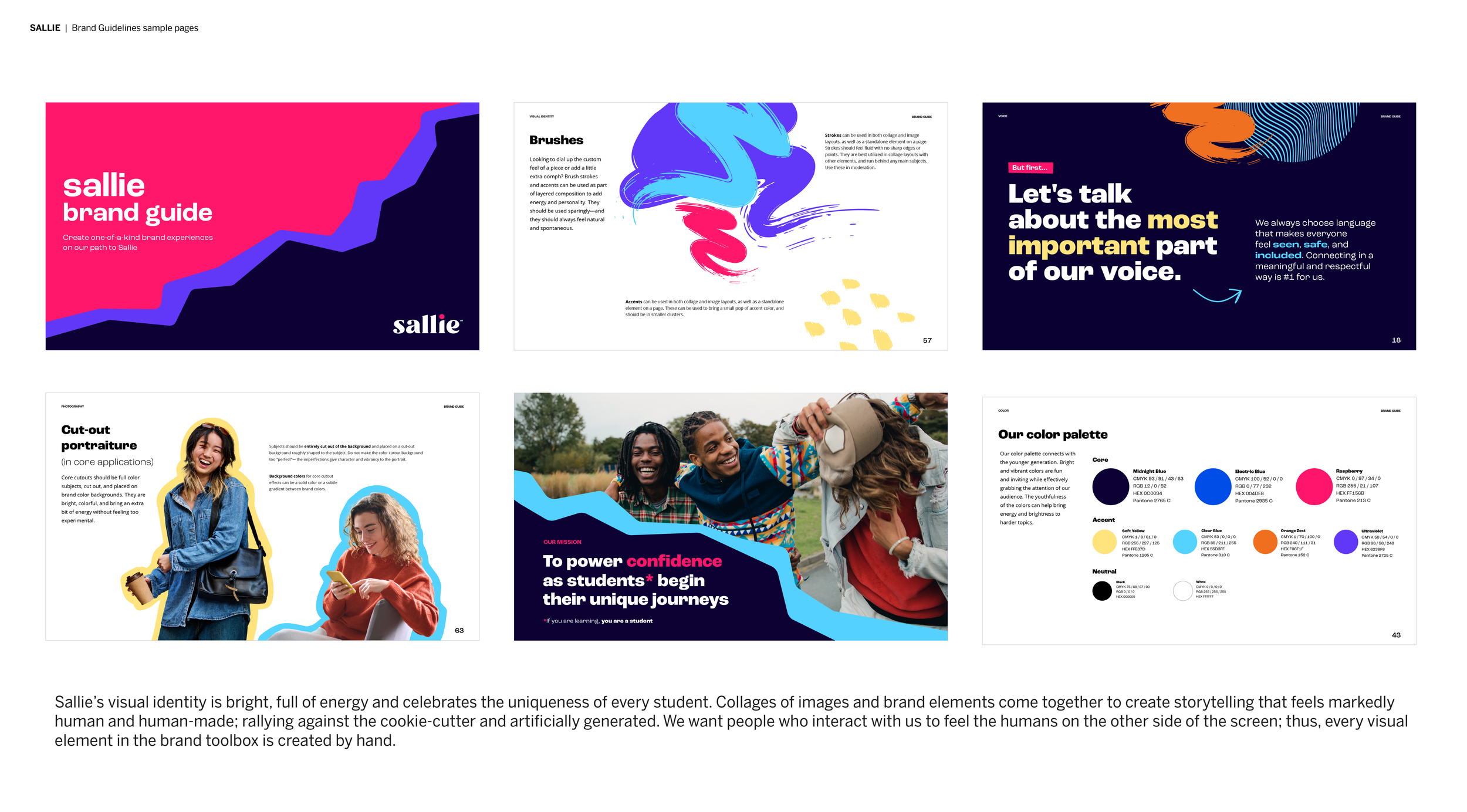
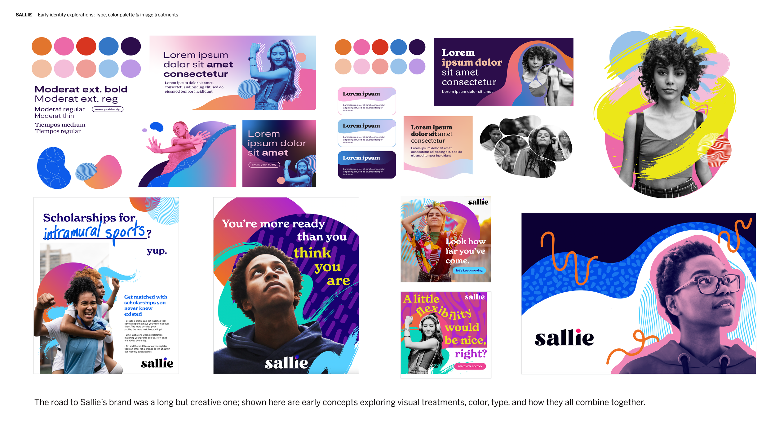
Starting in 2022, I had the incredible opportunity to help tackle creating an entirely new brand for Sallie Mae—called Sallie—from scratch. Sallie is the fledgling education services arm of our business which aims to be a helpful, no-nonsense source for all things planning for college. It was very important that Sallie’s visual identity was equal parts friendly and compassionate, while also feeling solid, grounded and trustworthy.
The base typeface of the wordmark is Astila, which then has been customized to have all points rounded for a slightly softer feel. Terminals along the bottom of all letters have also been flattened to help ground the wordmark. The “s” has been adjusted so less of the weight of the letter sits in the bottom ball terminal—this helps maintain the visual balance of “Sallie”. The “i” has been customized to curve downward along the left top edge, which together with the dot of the “i”, creates a subtle human silhouette—meant as a visual reminder of the individuality of every student.